Seamantika
Packaging Redesign
Seamantika
Packaging Redesign
Seamantika
Packaging Redesign
Project Overview
Project Overview
Project Overview
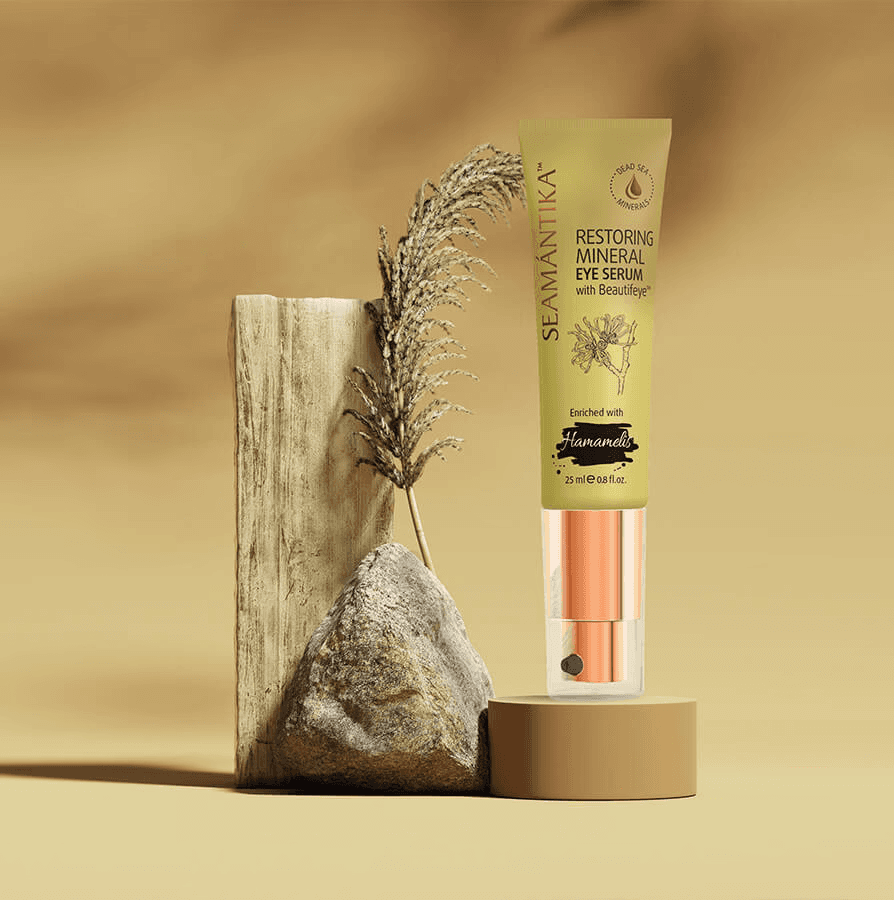
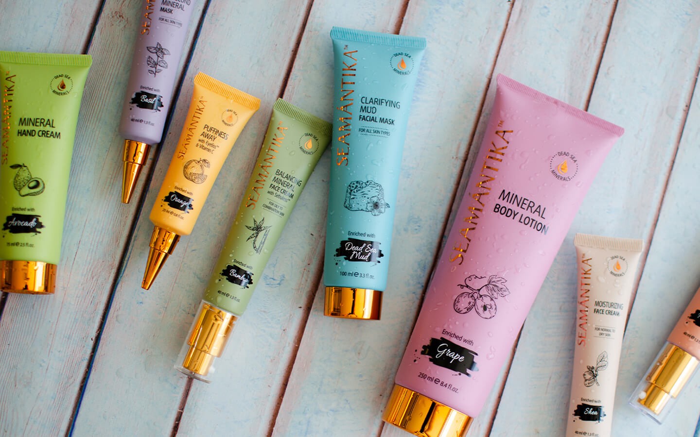
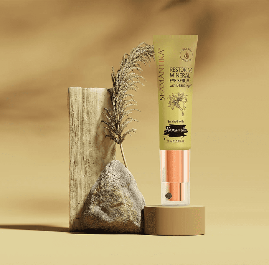
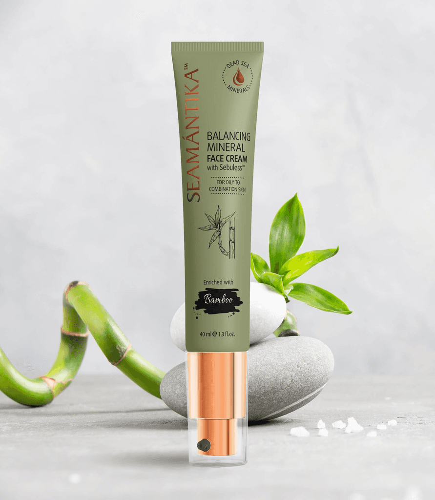
The goal of the Seamantika packaging redesign was to create a vibrant, modern, and premium look for our natural skincare products. The focus was on highlighting the natural ingredients in the composition and ensuring that the design conveys the quality and luxury of the products.
The goal of the Seamantika packaging redesign was to create a vibrant, modern, and premium look for our natural skincare products. The focus was on highlighting the natural ingredients in the composition and ensuring that the design conveys the quality and luxury of the products.
The goal of the Seamantika packaging redesign was to create a vibrant, modern, and premium look for our natural skincare products. The focus was on highlighting the natural ingredients in the composition and ensuring that the design conveys the quality and luxury of the products.
Key Design Elements
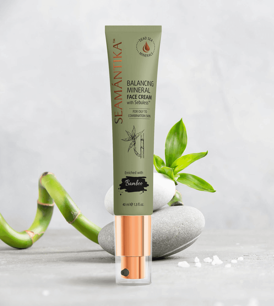
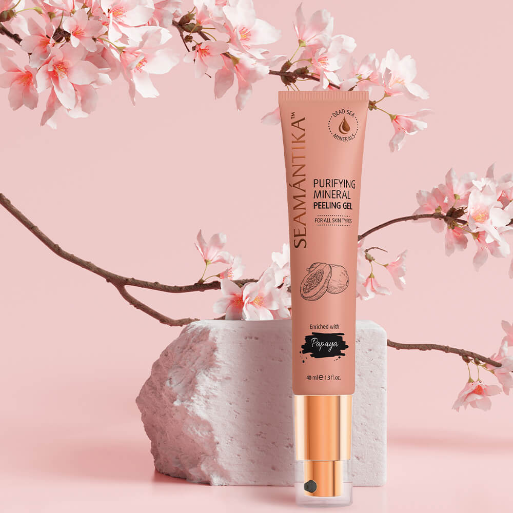
Color Palette: Each product features a unique color that represents its main ingredient, making the line visually appealing and easy to navigate.
Typography: Modern and clean fonts were used to enhance readability and give a contemporary feel.
Graphics: Simple and elegant illustrations of the key ingredients emphasize the natural aspect of the products.
Branding: The logo and other branding elements were refined to maintain brand consistency while adding a touch of modernity.
Key Design Elements
Color Palette: Each product features a unique color that represents its main ingredient, making the line visually appealing and easy to navigate.
Typography: Modern and clean fonts were used to enhance readability and give a contemporary feel.
Graphics: Simple and elegant illustrations of the key ingredients emphasize the natural aspect of the products.
Branding: The logo and other branding elements were refined to maintain brand consistency while adding a touch of modernity.
Outcome
The redesigned packaging successfully communicates the high quality and natural ingredients of Seamantika products. It appeals to a modern audience looking for premium natural skincare solutions.
The redesigned packaging successfully communicates the high quality and natural ingredients of Seamantika products. It appeals to a modern audience looking for premium natural skincare solutions.
Outcome
The redesigned packaging successfully communicates the high quality and natural ingredients of Seamantika products. It appeals to a modern audience looking for premium natural skincare solutions.