AQUA MINERAL
Packaging Redesign
AQUA MINERAL
Packaging Redesign
AQUA MINERAL
Packaging Redesign
Overview and Objective
Overview and Objective
Overview and Objective
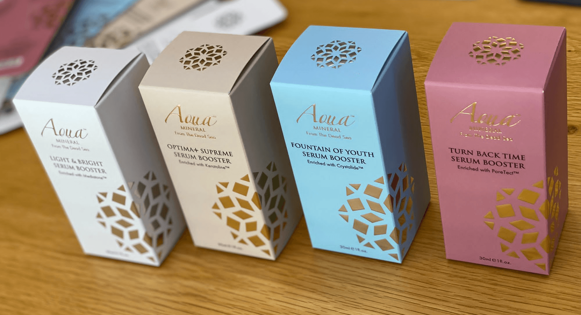
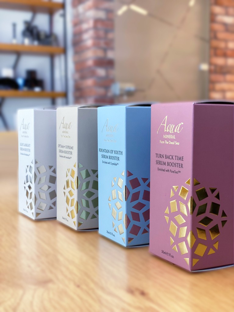
Aqua Mineral is a premium brand leveraging Dead Sea minerals and patented technologies. The packaging redesign aimed to reflect the brand’s luxurious and innovative nature, creating a sophisticated, cohesive visual identity that aligns with Aqua Mineral’s values of luxury, innovation, and effectiveness.
Aqua Mineral is a premium brand leveraging Dead Sea minerals and patented technologies. The packaging redesign aimed to reflect the brand’s luxurious and innovative nature, creating a sophisticated, cohesive visual identity that aligns with Aqua Mineral’s values of luxury, innovation, and effectiveness.
Aqua Mineral is a premium brand leveraging Dead Sea minerals and patented technologies. The packaging redesign aimed to reflect the brand’s luxurious and innovative nature, creating a sophisticated, cohesive visual identity that aligns with Aqua Mineral’s values of luxury, innovation, and effectiveness.
Key Design Elements
Materials and Finishes: High-quality, eco-friendly materials with metallic accents and embossing for a premium feel.
Visual Identity: Cohesive color scheme with distinct colors for each product, featuring the Aqua Mineral logo prominently. Each package includes a distinct icon located on the fold, adding a unique touch and aiding in product identification.
Functionality: User-friendly features like easy-open lids, secure closures, and spatulas for creams.

Outcome
The redesign successfully merges luxury with functionality, enhancing the customer experience and reinforcing Aqua Mineral’s premium market position.
The redesign successfully merges luxury with functionality, enhancing the customer experience and reinforcing Aqua Mineral’s premium market position.
Outcome
The redesign successfully merges luxury with functionality, enhancing the customer experience and reinforcing Aqua Mineral’s premium market position.